A look behind the magazine redesign process
I have been responsible for initiating two redesigns of Trout Fisherman magazine. Evolving the content and look of a magazine is key to engaging and maintaining readership.
Creating a new look
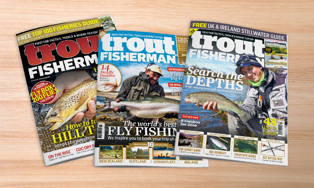
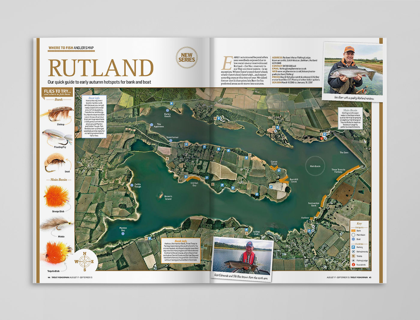
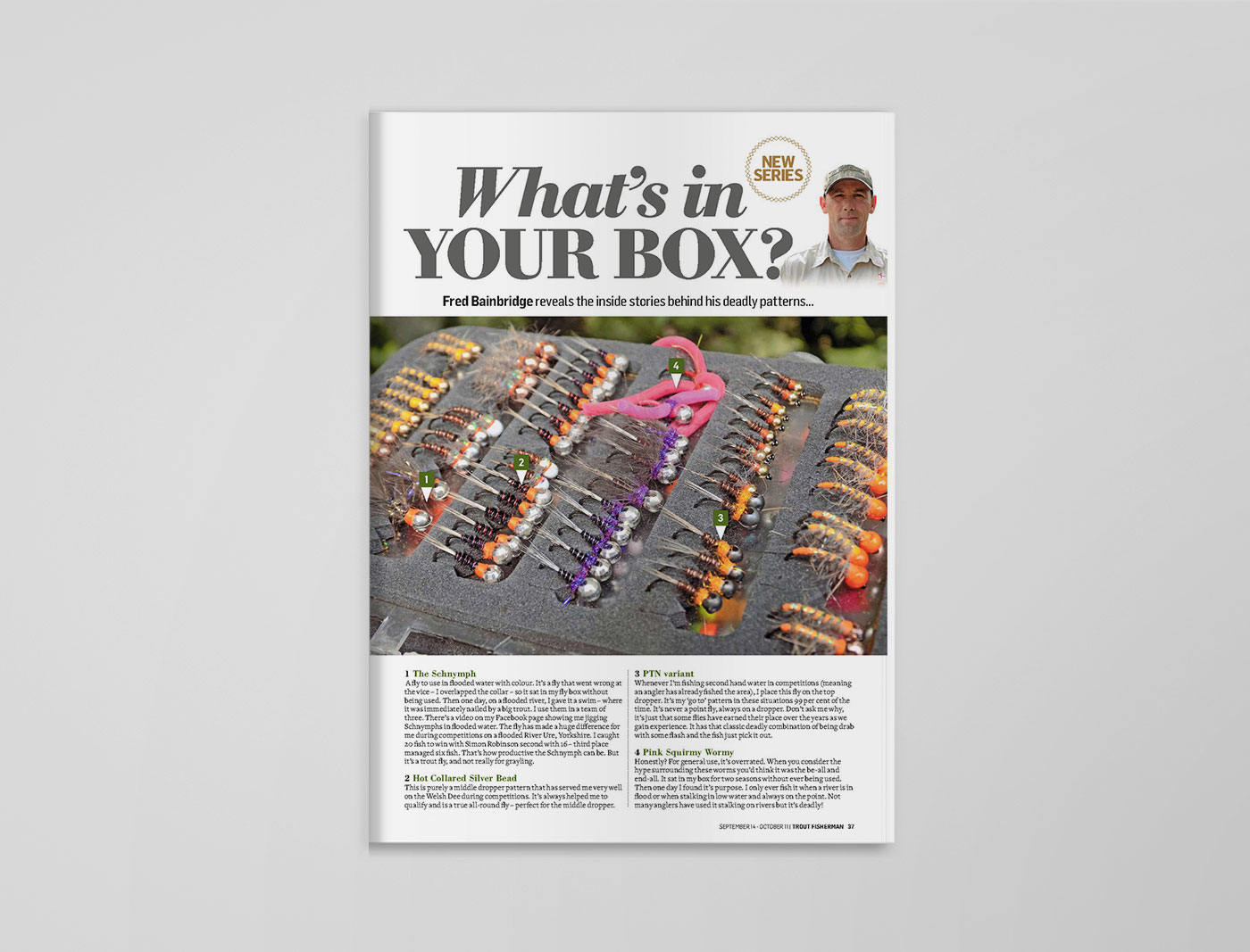
A more mature look was decided upon, stripping back the bright colours of the cover and editorial content to create a more minimal and streamlined style. The cover benefits from the addition of image panels at the bottom to enhance the practical aspect of the title. New content was also added, including the following:
Design evolution
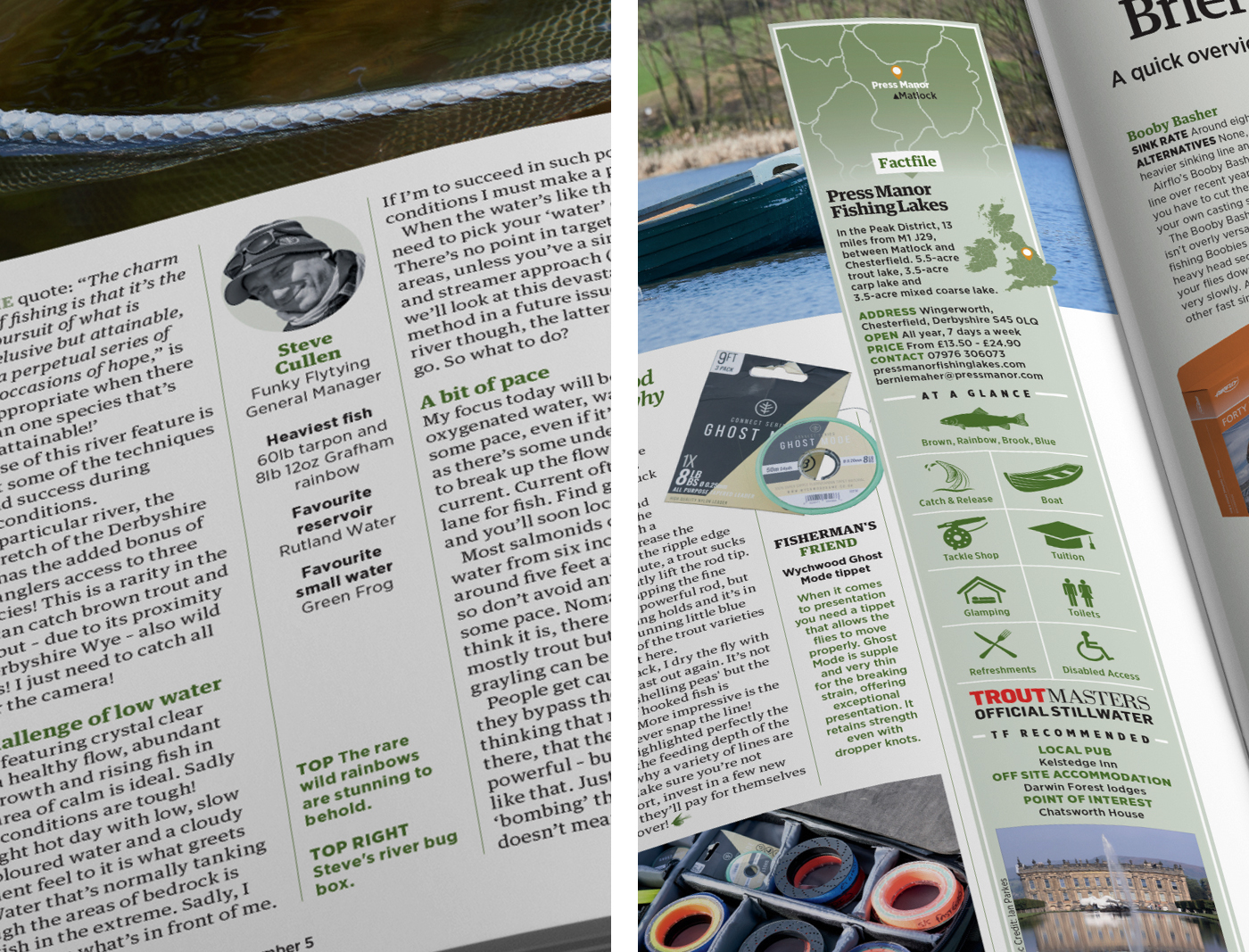
Over time further refinement built upon this initial redesign, leading the way to a second. I overhauled the fonts for bolder yet concise ones to improve legibility for the readership and simplified panel style to give a more modern look. Mini Angler Bios were added to features, giving an insight into the individuals background. Fishery fact files were enhanced with icons indicating key features such as species of fish available, types of fishing allowed and on-site facilities.
Client Bauer Media
